When I picked up art again in my 30’s, I didn’t know what to expect. There was an element of fear; as a kid with art skills, I felt like there was an expectation. What if I no longer have any skill? I might have been good as a kid, but who knows after a 15 year hiatus!
I started with calligraphy and regained the sort of hand eye coordination I had lost years ago. It was safe because it was new, which meant no pressure. Soon I was doing a heap of calligraphy work for private wedding clients and I wanted to up my game and do invitations with artwork. I knew it was the next step for my business.
But the thing about watercolour is there is a tonne to learn about how the paint works with the water, and how to know what mark your brush will make before it touches the paper. Needless to say I was mortified at how ‘rusty’ I was when I started experimenting all those years later. My fear was reality: my talent was gone.
I started experimenting with some cheap paints and brushes, started sketching more, and each and every time found myself disgusted, and disappointed.
Wedding crests came along as an easy first watercolour project. They were something people in the wedding industry longed to see more of, and there were only a handful of artists at the time doing them. I did one and put it on Instagram and Pinterest in hopes of catching someone’s eye. I still see that post floating around Pinterest sometimes. (It makes me want to run and hide under a table, or gouge my eyes out with a sharp stick.)
Needless to say, my work has evolved. I showed some of my early work to a colleague a few weeks ago and they nearly fell of their chair. ‘That’s YOURS?’ they said in shock. (Surely it couldn’t be that bad, right?)
I’ll let you decide for yourself.
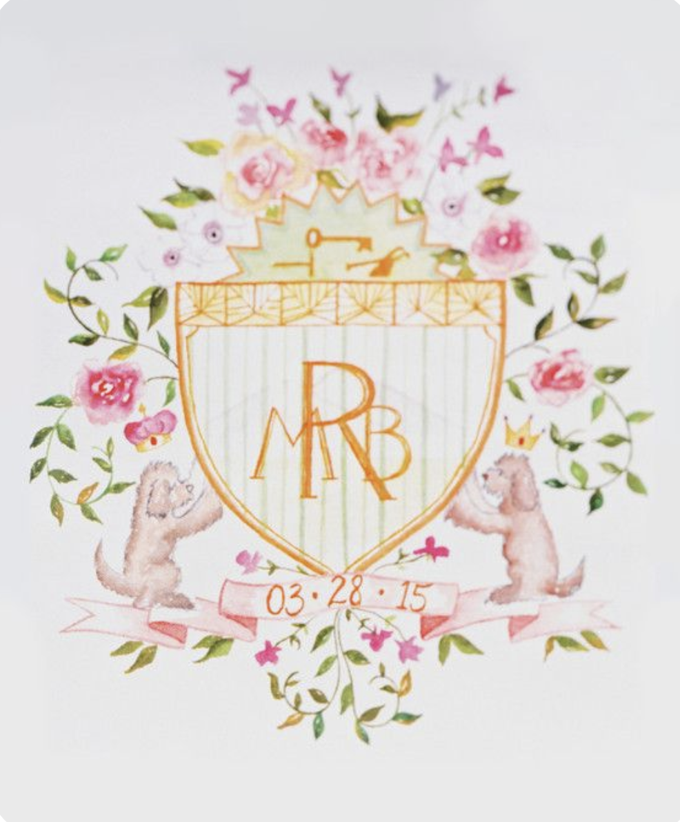
I think the biggest thing I struggled with (and clearly there were many) was finding my style. I didn’t have one, but worse yet, I didn’t know how to find one. I did what every other beginner does and tried on the styles I saw. Loose florals were all the rage so gave those a real try. Oh my goodness nobody butchers a loose floral like I do!!!
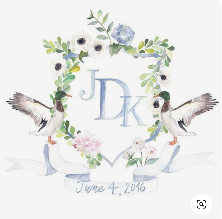
Notice how the greens are all pretty standard (from the tube shades), and digital versions are quite washed out looking.
Colour palette? What is that? Certainly not anything I gave much thought to other than the basics: blue is blue, pink is pink, etc.
The details in the flowers are minimal, but also messy. Artists with a looser watercolour style don’t typically have a sloppy result.
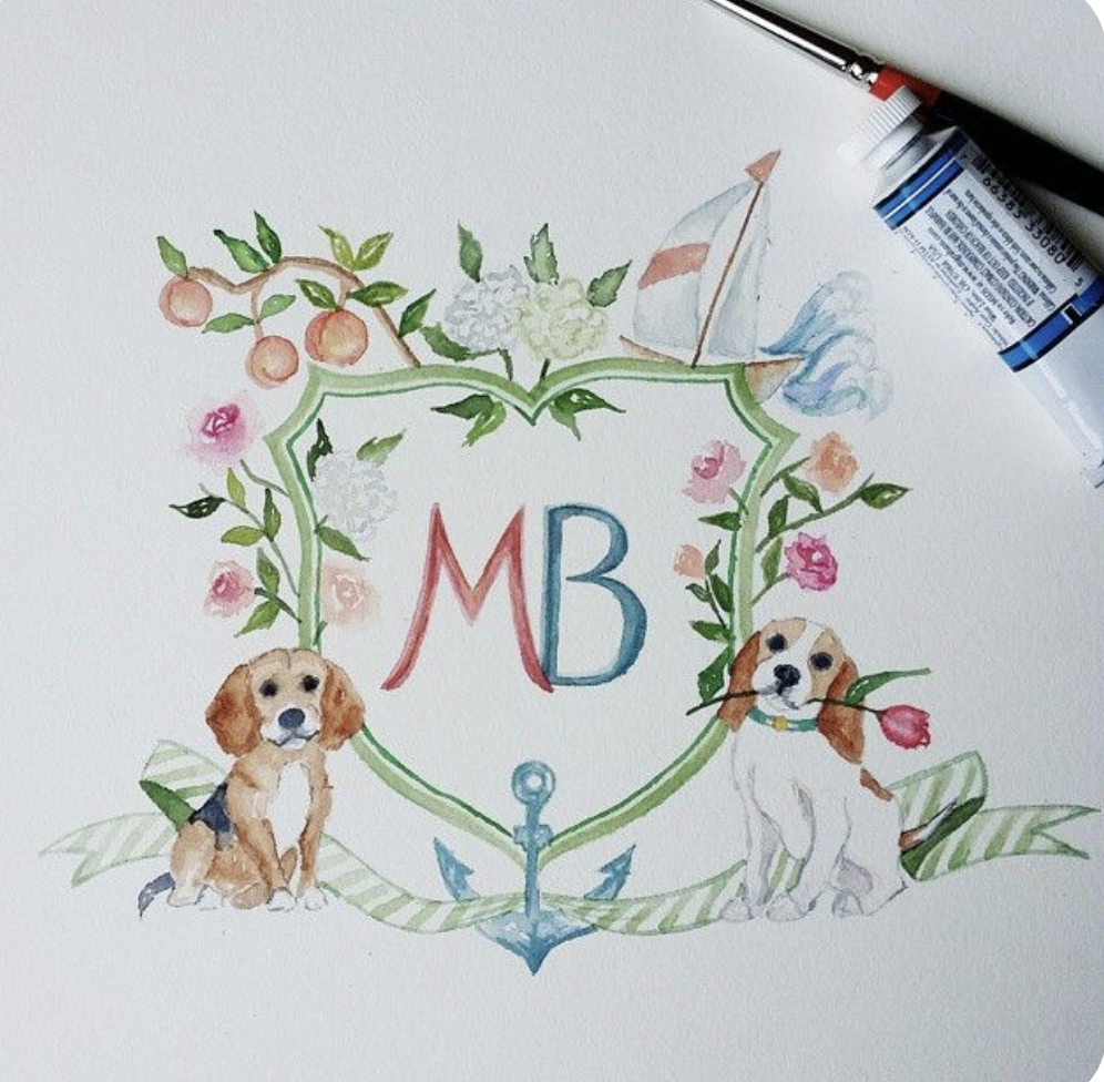
This one (above with the Beagles) was a photo of the on-paper version. I painted my emblems as one piece on paper in the beginning, which had many disadvantages but worked for my skill level at the time.
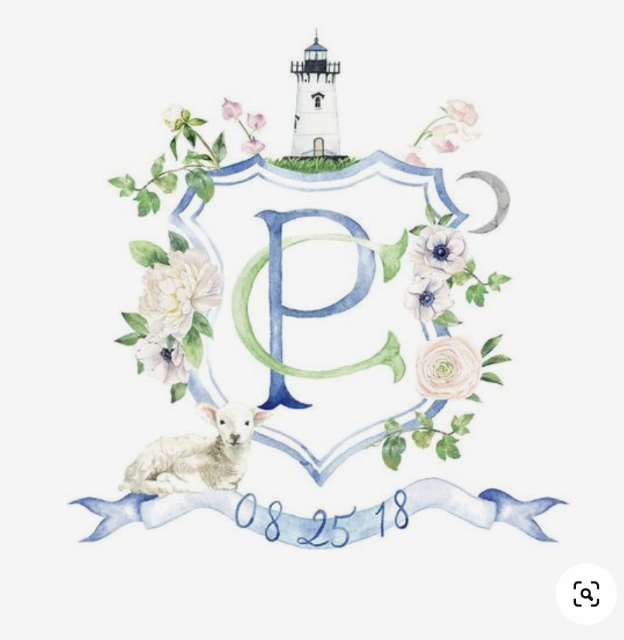
Needless to say, the evolution happened on the job. I was always busy, (which is kinda shocking given the above) but as my work evolved, so did my clientele. My style started to creep out. I found painting was more satisfying when I worked to a certain aesthetic. With that aesthetic came like-mind clients that pushed me to think about how blue isn’t just blue, but thousands of shades of blue and only one is exactly right for the job.
I started to look at proportion, depth of colour, highlights and shadows, and colour mixing. I realised that one of the quickest ways to kill a painting is to paint with colours straight from the tube. They flatten your work and the results have no depth or unique quality.
The digital side is the other half of the learning curve. One of the other massive issues with the work I showed you above is how poorly the illustrations were prepared for digital format. You can’t just scan at high resolution, pull out the background and call it a day! The work is only half finished.
Scanners do a fab job of picking up all the little details, but the light they use to scan the image also takes away some of the intensity of the colour and shadows. You have to put them back, and many times increase both so the illustration has clean edges and accurate colour intensity. Photographing your artwork for digital format can have the same effect. Light sources can tint your colours too blue or too yellow, create shadows, or wash out colours.
Back then, I just didn’t know the capabilities of photoshop well enough. I was self taught with the help of online tutorials and google searches, so each and every project was a learning experience! I learned a lot in just the first year or two of designing emblems, and continue to with every single project we work on. I have a few digital tips and tricks up my sleeve… read about them here: Tips and Tricks for Digitising Watercolour
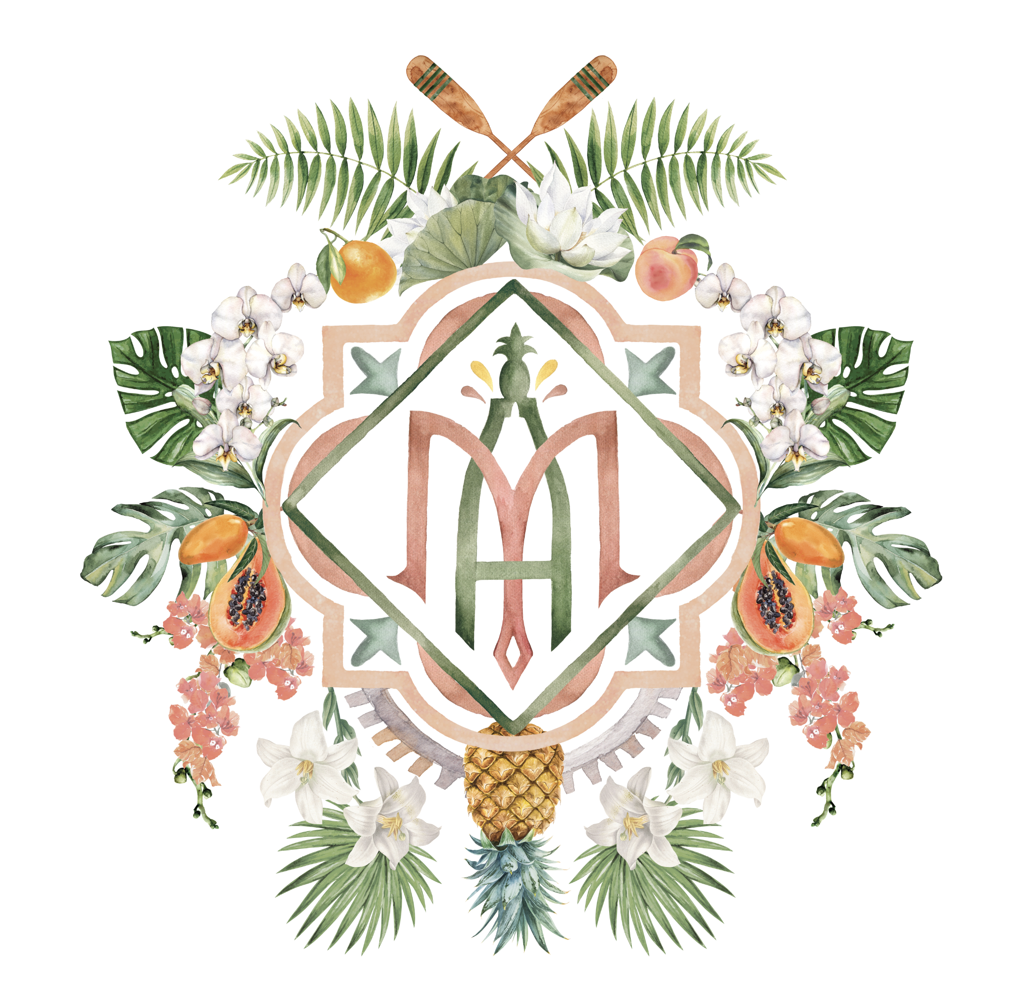
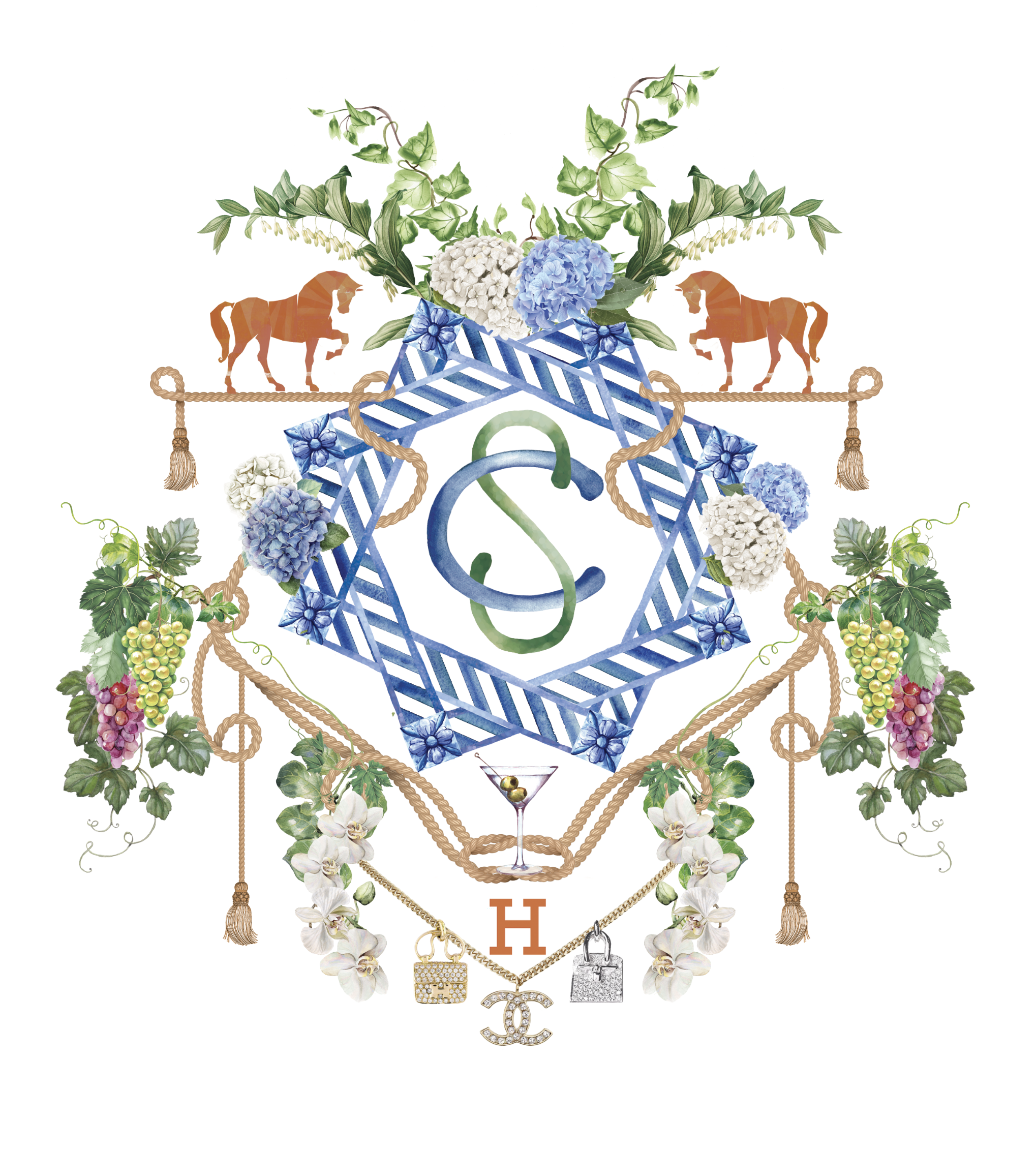
After 6 years of designing and creating emblems, my work has progressed beyond the fundamentals. I don’t just think about layout, colours, painting, and digital conversion; I’m interested in creating good DESIGN. Emblems that redefine family and event logos into something more chic and exquisitely unique. Less prescriptive.
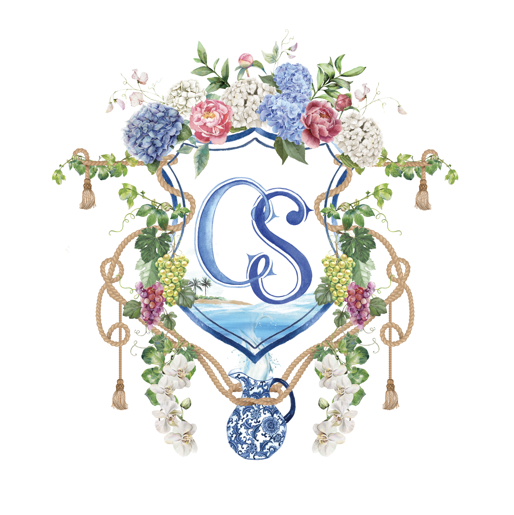
This next one still includes a classic ‘crest’ shield shape as the basis for the design. (Sometimes you can’t talk clients out of traditional) However the design still works well because everything included flows and looks as if it belongs. The clients wanted a blue and white vase or pot, so it’s being held by the rope and the ocean is flowing out the top into the water scene on the interior.
We all start somewhere. I would have loved to have someone standing along side, telling me what to watch out for and what to never do. But I also think there has been value in working it out for myself. I look back at my work from just a few years ago and the journey has been so valuable. My best advice: always try to out-do the last one.
