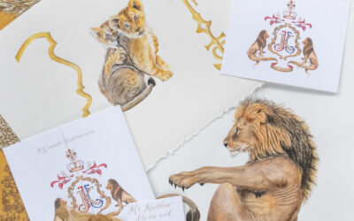
One of the biggest decisions an artist can make is whether or not to digitise their work. Many artists choose not to because they feel it’s not authentic, or true to the art form. Or because their business model doesn’t require them to. But then there are those like myself who see it as an opportunity to expand on the potential use of your work, types of projects you can do, and the versatility of your medium.
I do not regret my decision to learn the digital side of the art world. Granted, I’m no graphic designer. I don’t draw in illustrator using the digital medium to it’s full extent. I’ve learned how to take my hand drawn and painted work to the next level by pulling it into a digital format and using layering, tranparency, and general editing techniques to create more complex designs with my work.
There are lots of advantages to being able to design for a client this way. The top reason is editability. We can edit any element individually without repainting, and without altering any other elements. I can move things around, delete them, change colours of just one piece and generally do anything the client requests. It’s a huge part of ensuring that we provide the best collaborative process for our clientele. They have tremendous power and influence over their design from the very beginning through to final tweaks so their commission is exactly as they imagined.
So what equipment/knowledge do you need to do this?
- A scanner capable of scanning at a minimum of 600dpi
- Access to a photo editing program, ideally Photoshop
- General knowledge and some skill in your chosen photo editing program
I know that some choose to photograph their work rather than scanning, which is okay, but I still rely on my huge A3 architectural scanner (Epson Expression 10000XL). Photos are often blurry, distorted, or lighting can play a huge role in altering the colours of your original painting. A half decent scanner eliminates all those potential errors in the accurate digitising of your images.
For this post, I’m using Photoshop to demonstrate how to go about some of these little tips and tricks I’ve learned along the way.
Don’t paint small! You don’t want to have to enlarge your painting in order to use it in your design. And you don’t want your client increasing the size beyond the original painting, or they are going to get a fuzzy pixelated mess. If anything, you want to have to reduce the size of your painted elements a little bit so they are crisp, clear and you don’t lose detail. Scanning at 600dpi and keeping your scanned image the same size or smaller when you use it for your design is essential to the quality of the final result.
Those who are familiar with vectors might say, ‘why not pull it into illustrator and vectorise the image so this won’t happen?’. Yep, you could absolutely do that. But the first thing you’ll notice is how it changes the hand painted nature of the artwork. No matter how brilliantly you’ve tweaked the trace settings, it will ultimately change the quality of your image to a more digitally produced look. Only use vectors on an as-needed basis! And avoid it if possible.
That’s right, you’re going to have to tweak your colours and shadows. Watercolour is inheritantly transparent. You’ll have spots where you’ve used more layers of paint that are quite opaque, and other spots that are super see-through and more white once scanned! I’ve also found that my scanned work sometimes loses the intensity of the shadows, so tweaking with a levels layer is the best fix. Same with colour saturation – brightening up that blue can go a long ways to making a pale and lifeless design pop the way you intended.
This is part of the issue with so many digitally assembled pieces. They look collaged. They look like they are separate pieces, layered and stuck on top of one another. Blarg… that is not a good thing. Yes, that may be how you assembled the artwork so you could make tweaks once digital (you clever thing you!), but you don’t want your finished piece to show it. Transparency is key here. If you decrease your transparency just a little bit, it will ‘pull the element into the design’. Layers enable you to determine what sits in front, and what sits behind. But you can go a step further and ‘blend’ those top layers with the elements sitting underneath so they don’t appear to be ‘stuck’ on top like a sticker on paper.
In photoshop, click on the layer of the element you want to ‘blend’ a bit more with some transparency. At the top of your layers panel, click on ‘Opacity’ and slowly decrease from 100%, watching the element you’re changing. You don’t want it so low that it’s completely see through, but by decreasing just enough, it won’t pop from the page anymore. It will settle in with the rest of your elements and look like it’s on the same layer as what’s underneath! You can play with it until it looks and feels right to your eye.